![]() If there’s any thread that binds this edition of our annual, it is diversity. I mean this in terms of style and purpose, of course (as is true every year), but a wide range of voices and ideas also made itself especially evident in 2018.
If there’s any thread that binds this edition of our annual, it is diversity. I mean this in terms of style and purpose, of course (as is true every year), but a wide range of voices and ideas also made itself especially evident in 2018.
New Voices
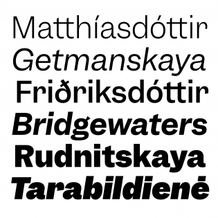
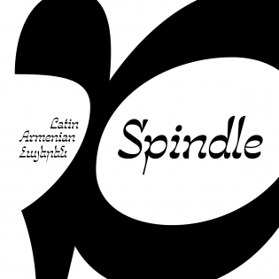
Our selection this year was more limited than usual in terms of quantity, yet the expansion and diversification of the type design community is still embodied by this shorter list — perhaps more than ever. Three new contributors — Agyei Archer, Tanya George, and Sandina Miller — join us, and there are typefaces from many designers who appear here for the first time: Connor Davenport (Garnett), Maria Doreuli (Chimera), Elias Hanzer (Phase), Gor Jihanian (Spindle), Adam Katyi (Mohol), Margot Lévêque (Kalice), Charles Mazé (Berthe), Krista Radoeva (FS Kim), Alice Savoie (Faune), Christian Vargas (Salvaje), and Mark van Wageningen (Ziza). Further emphasizing the global nature of excellence in type, these eleven young designers come from eight different countries.
Also making her first appearance on our list is someone who is certainly not new to anyone who follows type: Gudrun Zapf von Hesse. Sadly, she passed away last week, but in 2018 she left us with Hesse Antiqua, her first typeface release in decades and a fitting celebration of her 100th birthday.
New Models
Font distribution diversified in 2018 as well. Two years ago we noted the sprouting of new retailers in the market, and this year marked the first releases from Future Fonts. This gutsy project is not only a new place to get type, but a new platform for collaboration between type makers and users.
Future Fonts presented a challenge when we sent Type of 2018 nominations to contributors: If a font is available on the platform, does it count as an official release? What is an official release, anyway? Is it fair to review a typeface in its very early stages when it may appear in a much more mature format later on? In the end, we elected to officially suggest only those designs that Future Fonts labeled “Finished” in 2018, knowing that no typeface is ever truly finished and giving contributors the freedom to select whatever they were excited about, regardless of label.
More to Come
This annual is not finished, either. A few more selections are on their way, including the list of Other Notable Releases. We’ll announce them, along with each review, on Twitter, Instagram, and our favorite method of editorial distribution: RSS.
Credits
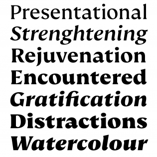
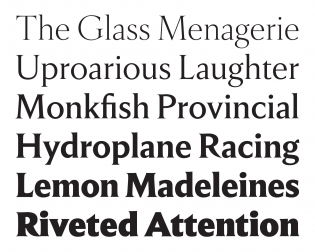
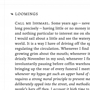
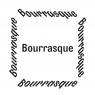
This year, Typographica puts a variable font through its paces for the first time since the format was introduced in 2016. We’re using an early version of Roslindale Variable, thanks to David Jonathan Ross. A single 135 KB font file delivers a small optical size for text, a medium size for decks (the first paragraphs of each review), a bold weight, and italics. Headlines are set in Nikolai by Franziska Weitgruber. This spiky dazzler was initially posted to Future Fonts in 2018 and revised throughout 2019. In keeping with the fast and frequent release tempo of our era, Nikolai was updated with italics today, just in time for the launch. The Favorites graphic is set in Bourrasque, with its novel slanting and backslanting styles. As always, Caren Litherland served as coeditor, coaxing copy from three dozen contributors into language that is accessible, accurate, and engaging. Thank you!
— Stephen Coles, Editor